 |
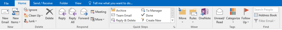
| Outlook 2019 Ribbon (Mac) |
 |
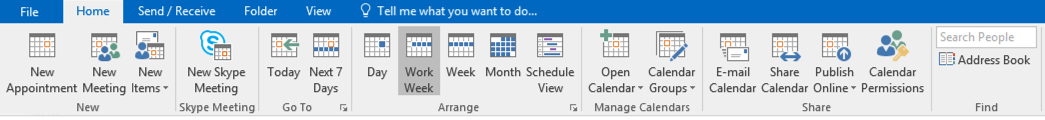
| Outlook 2016 Ribbon (PC) |
And the Calendar part of Outlook:
 |
| Outlook Calendar 2019 |
 | |
| Outlook Calendar 2016 |
Fundamentally it all handles the same, but the UI change is quite marked. In fact, this is reflected across all the suite - Word, Excel and Powerpoint all have tidier interfaces on the Mac. Whether this is reflective of the difference in styles between Apple and Microsoft or not I'm unsure about. It's definitely tidier and less busy - this appeals to me. The actual driving of the applications is largely the same.
Here is the compose window in a new email:
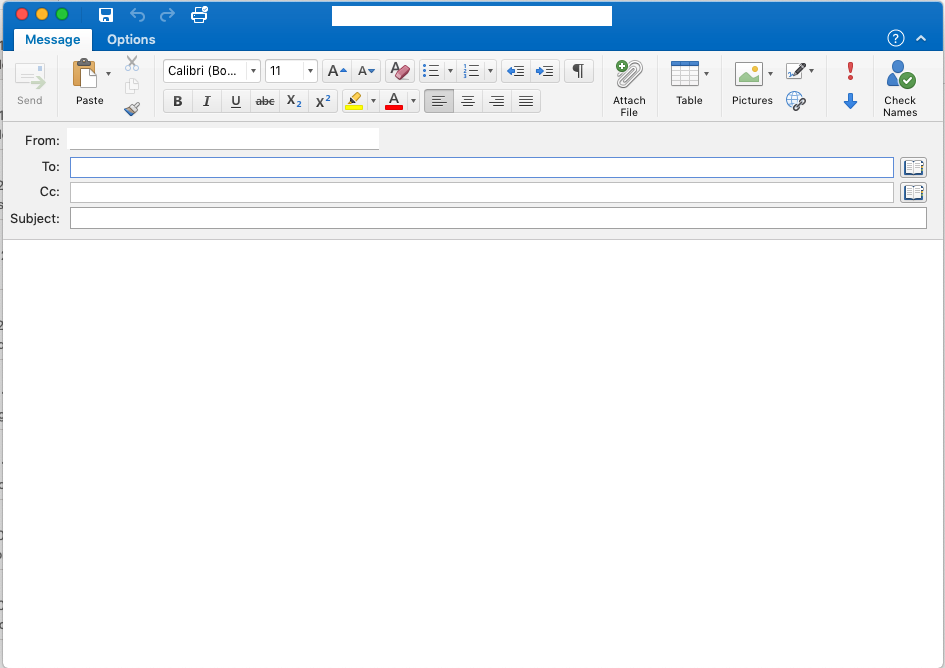 |
| New Email Outlook 2019 |
It's all pretty much the same, but you can see a more clean approach has been taken with the newer applications. I like it. I don't like Outlook as a rule, but I like this version of it better than previous versions.
The proof is in the utility - and both versions of Office are very useful. I'm still bewildered at times by the array of things you can do in Excel - it's one very full featured piece of software, and I probably will never use all of the stuff even in Word - which is probably why my preference is a simpler text editor like Pages.
Here's a snippet from Excel and you'll note that next to the green "Maximise" button in the top left hand corner is what looks like a little notebook - this is the File menu where new file etc all live:
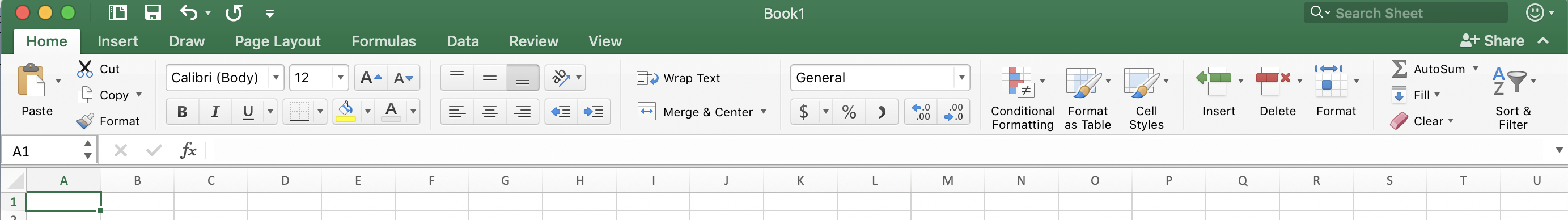 |
| Excel 2019 |
Again it's a slightly cleaner interface than 2016, but everything is there. With all the "File" activities hidden in that new button, there's nothing really missed out on. An Excel aficionado will probably say there are a million things not there but I'm not that guy.
Compare that ribbon to the Numbers ribbon:
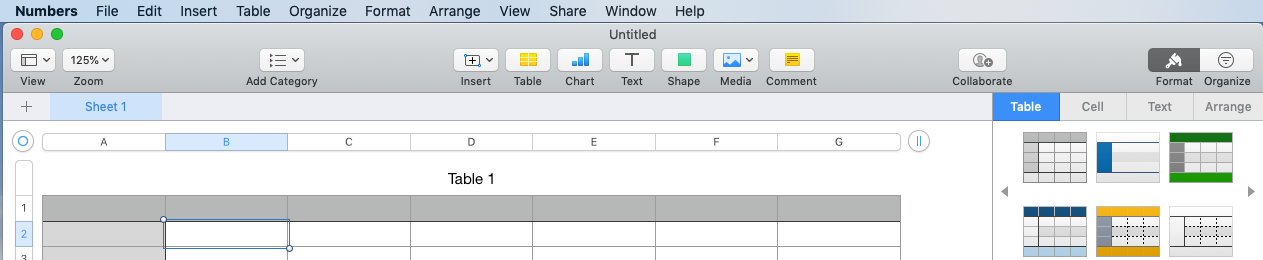 |
| The simplicity of Numbers |
It's a big UI (User Interface) difference. Given the rather limited activities I execute in spreadsheets, either one is suitable for my needs. I know that Numbers isn't adequate for some of the guys here at work who use Excel in extraordinary ways, but for the regular punter I think you'll find Numbers to be adequate.
At any rate, I thought you might find this interesting to see a brief comparison between the versions of Office and how different they look on different OS platforms. I can only hope that Microsoft release a version for Linux and I'll compare that one too!
I've cross posted this to my regular blogging account, so if you're interested in my wider range of thoughts check it out: abeath.blog
No comments:
Post a Comment